依背景色決定文字顏色的正確姿勢 - W3C 標準
| | | 5 | |
再來聊聊「依據背景色切換黑字或白字,確保文字明顯容易閱讀」這檔事。
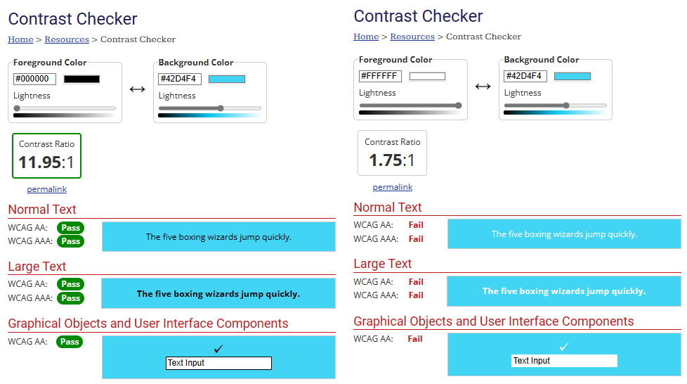
過去我都用 Github Copilot 教我的186 魔術數字公式:complementary = (r * 0.299 + g * 0.587 + b * 0.114) > 186 ? '#000000' : '#ffffff',但上回在 20 種差異鮮明色彩組合用這招決定文字顏色,讀者 lke 提醒,我為 #42d4f4 配了白字,看起來不太明顯。對照原文網頁範例,同一顏色配了黑字,看起來的確比白字明顯許多。這讓我開始懷疑,莫非 186 公式有缺陷?
剛好在 FB 留言看到李奎翰大大分享的重要情資:關於文字顏色對比,W3C 的 WCAG 網站內容無障礙指南其實已有明確標準 - G18: Ensuring that a contrast ratio of at least 4.5:1 exists between text (and images of text) and background behind the text,而文字與背景色對比度有兩個認證等級:(貫徹無障礙網站的難度不亞於下油鍋,這裡淺嚐就好,恕不再深入)
- AA - 文字與背景對比值需大於 4.5:1
- AAA - 文字與背景對比值需大於 7:1
我找到檢查對比值是否符合 WCAG 標準的網站,確認 #42d4f4 應該配黑字才是正解,配白字只對比只有 1.75:1,死當!!
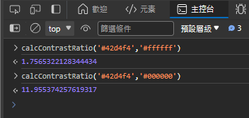
G18 標準有提供完整的 RGB 值換算相對亮度(Relative Luminance)及對比值的公式,我將公式轉成 JavaScript 函式:
const calcLuminance = (hex) => {
    const m = /^#?([a-f\d]{2})([a-f\d]{2})([a-f\d]{2})$/i.exec(hex);
    const colors = [parseInt(m[1], 16), parseInt(m[2], 16), parseInt(m[3], 16)];
    const [r, g, b] = colors.map(c => {
        const r = c / 255.0;
        if (r <= 0.03928) {
            return r / 12.92;
        } else {
            return Math.pow((r + 0.055) / 1.055, 2.4);
        }
    });
    return 0.2126 * r + 0.7152 * g + 0.0722 * b;
}
const calcContrastRatio = (hex1, hex2) => {
    let L1 = calcLuminance(hex1);
    let L2 = calcLuminance(hex2);
    if (L1 < L2) {
        [L1, L2] = [L2, L1];
    }
    return (L1 + 0.05) / (L2 + 0.05);
}
成功算出 1.7565 跟 11.9553,與檢測網站的計算結果一致。
再來便是在已知背景色時,決定該用 #000000 還是 #fffff。
依 G18 文件,若有兩種顏色,其相對亮度分別為 L1 及 L2,則二者之對比值可表示為:
(L1 + 0.05) / (L2 + 0.05)
黑字的使用時機應為「黑字與背景色的對比值」大於「白字與背景色的對比值」,黑色與白色的相對亮度分別為 0、1,若背景色之相對亮度為 L,代入上方公式可得:
(L + 0.05) / (0 + 0.05) > (1 + 0.05) / (L + 0.05)
化簡以上公式,會得到魔術數字 0.179:
  (L + 0.05) / 0.05 > 1.05 / (L + 0.05)
→ (L + 0.05)^2 / 0.05 > 1.05
→ (L + 0.05)^2 > 1.05 * 0.05
→ L + 0.05 > sqrt(1.05 * 0.05)
→ L > sqrt(1.05 * 0.05) - 0.05
→ L > 0.179
寫成黑白字判斷函式:
const getTextColorWcag = (hex) =>
    calcLuminance(hex) > 0.179 ? '#000000' : '#ffffff';
最後,比對一下 186 版及 G18 版文字配色效果:線上展示
<!DOCTYPE html>
<html>

<head>
    <meta charset="utf-8" />
    <script src="https://unpkg.com/vue@3"></script>
    <style>
        .palette {
            display: flex; margin-bottom: 12px;
            flex-direction: row; flex-wrap: wrap;
            width: 900px; font-size: 10pt;
            font-family: 'Segoe UI', Tahoma, Geneva, Verdana, sans-serif;
        }

        .palette>div {
            position: relative; width: 72px; height: 150px;
            margin: 2px; padding: 6px;
        }

        .palette .chk {
            background-color: white; text-align: center;
            margin-top: 8px; margin-bottom: 8px;
        }

        .palette .chk span {
            color: red; text-decoration: line-through;
            margin-right: 4px;
        }

        .palette .chk span.pass {
            text-decoration: none; color: green;
            font-weight: bolder;
        }
    </style>
</head>

<body>
    <div id="app">
        <div class="palette">
            <div v-for="(color,idx) in colors" :style="{ backgroundColor: color.bg }">
                <div v-for="fg in color.fgColors" :style="{ color: fg.fg }">
                    <div>{{ color.bg }}</div>
                    <div>{{ fg.ratio.toFixed(2) }}</div>
                    <div class="chk">
                        <span :class="{'pass':fg.aa}">AA</span>
                        <span :class="{'pass':fg.aaa}">AAA</span>
                    </div>
                </div>
            </div>
        </div>
    </div>
    <script>
        const pool = ['#e6194B', '#3cb44b', '#ffe119', '#4363d8', '#f58231', '#911eb4', '#42d4f4', '#f032e6', '#bfef45', '#fabed4', '#469990', '#dcbeff', '#9A6324', '#fffac8', '#800000', '#aaffc3', '#808000', '#ffd8b1', '#000075', '#a9a9a9', '#ffffff', '#000000'];

        const getTextColor186 = (hex) => {
            const m = /^#?([a-f\d]{2})([a-f\d]{2})([a-f\d]{2})$/i.exec(hex);
            return (parseInt(m[1], 16) * 0.299 + parseInt(m[2], 16) * 0.587 + parseInt(m[3], 16) * 0.114) > 186 ? '#000000' : '#ffffff';
        }

        const calcLuminance = (hex) => {
            const m = /^#?([a-f\d]{2})([a-f\d]{2})([a-f\d]{2})$/i.exec(hex);
            const colors = [parseInt(m[1], 16), parseInt(m[2], 16), parseInt(m[3], 16)];
            const [r, g, b] = colors.map(c => {
                const r = c / 255.0;
                if (r <= 0.03928) {
                    return r / 12.92;
                } else {
                    return Math.pow((r + 0.055) / 1.055, 2.4);
                }
            });
            return 0.2126 * r + 0.7152 * g + 0.0722 * b;
        }
        const calcContrastRatio = (hex1, hex2) => {
            let L1 = calcLuminance(hex1);
            let L2 = calcLuminance(hex2);
            if (L1 < L2) {
                [L1, L2] = [L2, L1];
            }
            return (L1 + 0.05) / (L2 + 0.05);
        }
        const getTextColorWcag = (hex) =>
            calcLuminance(hex) > 0.179 ? '#000000' : '#ffffff';

        const colors = pool.map(hex =>
        ({
            bg: hex,
            fgColors:
                [getTextColor186(hex), getTextColorWcag(hex)].map(fg => {
                    const ratio = calcContrastRatio(fg, hex);
                    return {
                        fg, ratio, aa: ratio >= 4.5, aaa: ratio >= 7
                    };
                })
        }));

        const app = Vue.createApp({
            data() {
                return {
                    colors: colors
                }
            }
        });
        var vm = app.mount('#app');
    </script>

</body>

</html>
每個背景色有兩組結果,上方為 186 公式計算結果(對比值、是否符合 AA、AAA 標準),下方為 G18 公式計算結果,抓出 186 公式為草綠(Green)、橘色(Orange)、青色(Cyan)、品紅(Magenta)、青色(Teal)、橄欖(Olive)、灰(Gray)配了白色,對比值不符合 AA 標準。
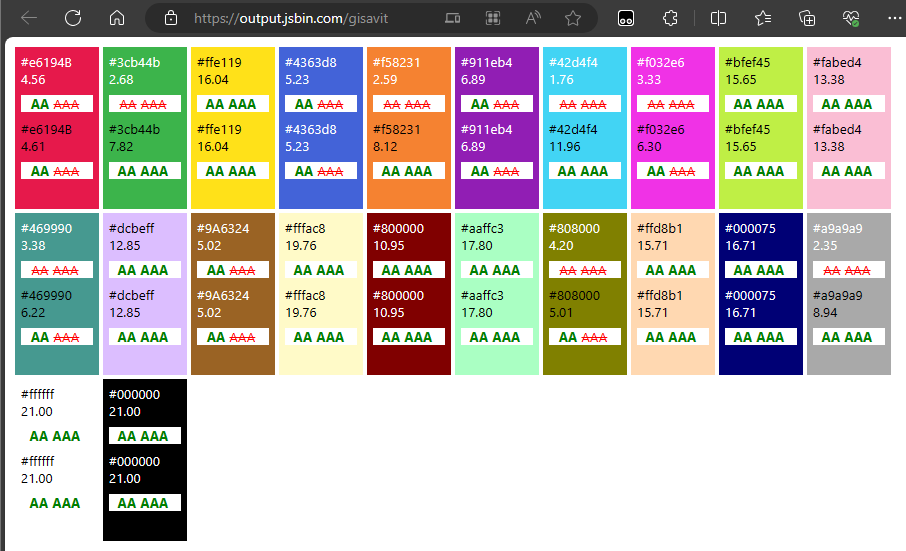
而 G18 公式計算結果全部符合 AA,但有七種未達 AAA 標準,實務應用應避免以提高網頁可讀性。
Knowledge of WCAG G18 guildeline to decide correct text color for different background color.
Comments
# by Mathew Chan
有用 先收藏
# by Ike
可惜有些顏色體感還是白字比較好,例如:#e6194B (為什麼 B 是大寫???)、#469990
# by icecain
在我看起來,G18那排,有幾組配色對比反而不如186那組明顯 上1(#e6194B),上8(#f032e6),下1(#469990),下7(#808000) 現在主流瀏覽器有支援css的lch標色法 https://lea.verou.me/blog/2020/04/lch-colors-in-css-what-why-and-how/ 如果先決定好字要用黑或白,固定L(亮度)、C(彩度),改變H(色相) 是不是比較容易得到幾組視覺重量相近的色票?
# by Jeffrey
to icecain,我也有同感,有些 186 配白字的組合雖然對比值低但視覺上比黑字更清晰順眼,但這是我個人的感受,在色弱或視力障礙使用者眼中未必如此,我相信 WCAG 標準背後有科學研究支持,應該會比個人主觀感受更值得參考。
# by 貴
當初為了產出給深度學習使用的訓練資料,使用隨機產生的背景顏色跟互補色的文字,有些結果對比很不明顯,當時不知道有這些公式可以用來計算對比,今天終於學到了