手捏支援 Vue v-model 的可清除文字輸入框
 |  | 0 |  |
自從 IE 登出,Trident 版 Edge 被放生,瀏覽器重回大一統時代。有別於前次的 IE 王朝,當今主宰前端的 Chromium 配備的 HTML / JavaScript / CSS 規格完備,功能與二十年前不可同日而語,且會自動更新不用太擔心支援問題,現在寫前端輕鬆許多。
2016 加入的自訂 HTML 元素功能深得我心,自訂元素這檔事幾乎所有前端框架都有自己的玩法,我玩過 knockout.js、AngularJS、Vue.js,每個都有,甚至早在 IE6 時代,微軟也有自家的網頁元件技術 - .htc HTML Component。自訂網頁元件,易於設計維護擴充重用,就像在前端 UI 實踐物件導向設計,好處很多。如今瀏覽器原生支援自訂網頁元素,不需依賴任何框架,效能更佳,運用起來更靈活。
UI 元素行為封裝成自訂 HTML 元素,最大好處是享受物件導向設計的低耦合與觀注點分離,大大提高程式碼可重用性及可維護性。原生 HTML 自訂元素之前曾玩過一回,做了會滾動的骰子,這回遇到另一個小需求,我想寫過自帶 X 鈕可清空內容的文字輸入框。
要做個帶 X 鈕的文字輸入框不難,一個 <input type="text"> 配上用 CSS 排版及自動隱藏的 <button> 就可以搞定,但我有個額外需求是想支援 Vue.js 的 v-model 繫結,讓它可以當成一般的 <input type="text"> 使用。
先展示成果:
<!DOCTYPE html>
<html lang="en">
<head>
<meta charset="UTF-8">
<title>自帶清除鈕文字欄位 Web Component (支援 Vue v-model)</title>
<script src="https://unpkg.com/vue@3/dist/vue.global.js"></script>
<script src="textInputWithClearBtn.js"></script>
<style>
body {
font-family: Arial, sans-serif;
margin: 20px;
}
h2 {
color: #444;
}
input-with-clear-button {
margin-bottom: 10px;
display: block;
}
</style>
</head>
<body>
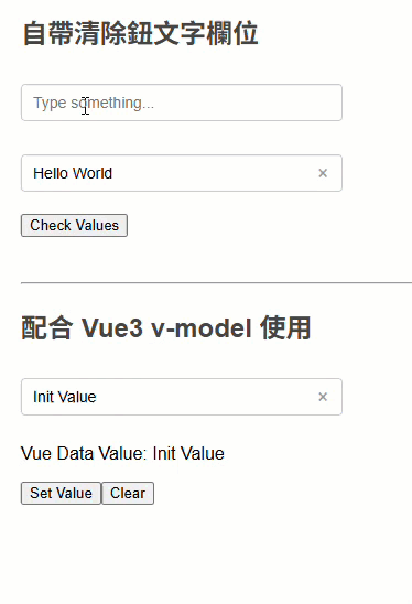
<h2>自帶清除鈕文字欄位</h2>
<input-with-clear-button id="t1" placeholder="Type something..."></input-with-clear-button>
<input-with-clear-button id="t2" value="Hello World"></input-with-clear-button>
<button onclick="showValues()">Check Values</button>
<pre id="results">
</pre>
<script>
function showValues() {
document.getElementById('results').textContent =
`t1: "${document.getElementById('t1').value}"
t2: "${document.getElementById('t2').value}"`;
}
</script>
<hr>
<div id="app">
<h2>配合 Vue3 v-model 使用</h2>
<input-with-clear-button v-model="searchText" placeholder="Search..."></input-with-clear-button>
<p>Vue Data Value: {{ searchText }}</p>
<button @click="searchText = 'Hello Vue3'">Set Value</button>
<button @click="searchText = ''">Clear</button>
</div>
<script>
const { createApp } = Vue;
createApp({
data() {
return {
searchText: 'Init Value'
}
}
}).mount('#app');
</script>
</body>
</html>
以上網頁展示單獨使用 <input-with-clear-button>,使用 document.getElementById('t1').value 取值,以及 <input-with-clear-button v-model="searchText" placeholder="Search..."> 以 v-model 整合 Vue.js MVVM,兩種玩法都支援:
<input-with-clear-button> 定義我寫在獨立 textInputWithClearBtn.js,補充幾個小細節:
- 用 IIFE 把定義元件的邏輯包起來,可避免其變數名稱跟其他程式打架。
- 最早我想到的做法是在 HTML 模版內嵌
<style>指定樣式,缺點是每次產生元件 HTML 會重複一次樣式宣告,累贅又沒效率。改用 new CSSStyleSheet()、.replaceSync() 定義 CSS 樣式,HTML 元件透過 adoptedStyleSheets() 共用樣式,優雅多了。 - observedAttributes() 配合 attributeChangedCallback(name, oldValue, newValue) 可在 Attribute 異動時觸發處理邏輯。
- 實測實作 get value() / set value() 後,
<input type="text">的按鍵動作便會觸發 Vue v-model 繫結,但按清除鈕 input.value = '' 時需另外呼叫this.dispatchEvent(new Event('input', { bubbles: true }));模擬 input 事件。
(function() {
    // 建立共用的 CSSStyleSheet
    const sharedStyles = new CSSStyleSheet();
    sharedStyles.replaceSync(`
        .text-input-w-clr-btn {
            position: relative;
            display: inline-block;
            margin: 10px 0;
            input {
                padding: 8px 30px 8px 10px;
                font-size: 14px;
                border: 1px solid #ccc;
                border-radius: 4px;
                outline: none;
                min-width: 250px;
                &:focus { border-color: #4CAF50; }
                &:not(:placeholder-shown)~.clear-btn {
                    display: block;
                }
            }

            .clear-btn {
                position: absolute;
                right: 8px;
                top: 50%;
                transform: translateY(-50%);
                background: none;
                border: none;
                cursor: pointer;
                color: #999;
                font-size: 18px;
                padding: 0;
                width: 20px;
                height: 20px;
                line-height: 20px;
                text-align: center;
                display: none;
                &:hover { color: #333;}
            }
        }
        `);

    class CustomInput extends HTMLElement {
        // 宣告要監聽的屬性
        static get observedAttributes() {
            return ['value'];
        }

        constructor() {
            super();
            this.attachShadow({ mode: 'open' });
            this.shadowRoot.adoptedStyleSheets = [sharedStyles];
        }
        // 元素插入 DOM 時觸發
        connectedCallback() {
            // 取得 placeholder 屬性值,若無則使用預設值
            const placeholder = this.getAttribute('placeholder') || 'Enter text...';
            const initialValue = this.getAttribute('value') || '';

            // 產生元件 HTML
            this.shadowRoot.innerHTML = `
                    <div class="text-input-w-clr-btn">
                        <input type="text" placeholder="${placeholder}" value="${initialValue}">
                        <button class="clear-btn" type="button">×</button>
                    </div>
                `;

            const input = this.shadowRoot.querySelector('input');
            const clearBtn = this.shadowRoot.querySelector('.clear-btn');

            clearBtn.addEventListener('click', () => {
                input.value = '';
                input.focus();
                this.dispatchEvent(new Event('input', { bubbles: true }));
            });
        }

        // 元素從 DOM 移除時觸發
        disconnectedCallback() {

        }

        // 當屬性變更時同步更新 input 值
        attributeChangedCallback(name, oldValue, newValue) {
            if (name === 'value' && this.shadowRoot) {
                const input = this.shadowRoot.querySelector('input');
                if (input && input.value !== newValue) {
                    input.value = newValue || '';
                }
            }
        }

        // 提供 value 的 getter/setter 供 Vue3 使用
        get value() {
            return this.shadowRoot?.querySelector('input')?.value || '';
        }

        set value(val) {
            const input = this.shadowRoot?.querySelector('input');
            input && (input.value = val || '');
        }
    }

    customElements.define('input-with-clear-button', CustomInput);
})();
附上線上展示
註:用原生自訂 HTML 元素跟 Vue 整合,訴求是彈性,可單獨使用不一定綁死 Vue;但若開發環境確定有 Vue 且元件行為跟 Vue 緊密融合,則建議用 Vue 寫自訂元件比較省力。
Showcases a native custom HTML input element with a clear (X) button, supporting both standalone use and Vue v-model binding for better reusability and maintainability.
Comments
Be the first to post a comment