HTML表格欄寬分配實驗
 |  | 0 |  |
接獲報案,某個KendoUI Grid網頁,調整瀏覽器顯示比例縮放後,最後一欄會莫名消失。
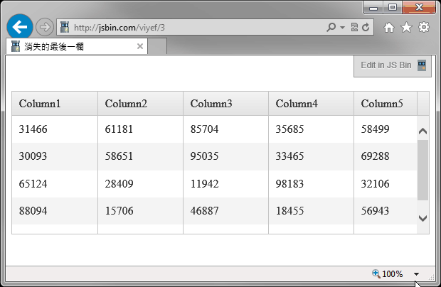
試著重現問題。如上圖所示,顯示比例100%時可以看到Column1到Column5共五欄,調整比例到125%,欄位放大,Gird下方出現捲軸,但向右捲動到底只見Column4,Column5不見了。除了調整顯示比例,改變視窗寬度也有同樣效果,只要寬度不足導致水平捲軸,Column5就會消失。
程式碼如下: [Live Demo]
<!DOCTYPE html>
<html>
<head>
<link href="http://cdn.kendostatic.com/2013.3.1119/styles/kendo.common.min.css"
rel="stylesheet" type="text/css" />
<link href="http://cdn.kendostatic.com/2013.3.1119/styles/kendo.default.min.css"
rel="stylesheet" type="text/css" />
<meta charset="utf-8">
<title>消失的最後一欄</title>
<style>
.grid { margin-top: 50px; } </style>
</head>
<body>
<div class='grid'>
</div>
<script src="http://ajax.aspnetcdn.com/ajax/jQuery/jquery-1.9.1.js "></script>
<script src="http://ajax.aspnetcdn.com/ajax/knockout/knockout-3.0.0.js "></script> <script src="http://cdn.kendostatic.com/2013.3.1119/js/kendo.web.min.js"> </script>
<script>
function item() { for (var i = 1; i <= 5; i++) {
this["C" + i] = parseInt(Math.random() * 100000);
}
}
var dummyData = []; for (var i = 0; i < 5; i++) {
dummyData.push(new item()); }
$(".grid").kendoGrid({ dataSource: { data: dummyData }, height: 200,
columns: [
{ field: "C1", title: "Column1", width: 120 }, { field: "C2", title: "Column2", width: 120 }, { field: "C3", title: "Column3", width: 120 }, { field: "C4", title: "Column4", width: 120 }, { field: "C5", title: "Column5" } ]
});
</script>
</body>
</html>
經過一番檢查,發現kendoGrid產生的表格HTML如下:
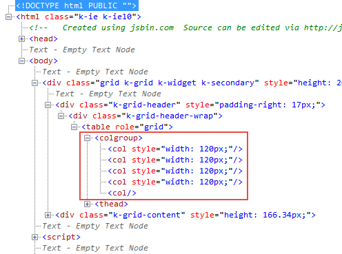
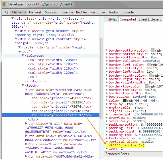
追根究底,問題網頁在設定kendoGrid欄位時為前四欄指定寬度,第五欄則無,原意是要第五欄吃下所有剩餘寬度。但由結果來看,第五欄的確是吃剩餘寬度,當寬度不夠時,變成0好像也沒錯。使用Chrome觀察,得到更有趣的結果 -- 第五欄的寬度是負值(-20.1875px)!
找到原因,第五欄消失的茶包在指定寬度後瞬間被KO,但留下兩個疑問:
- 使用<col style="width: 120px">指定固定欄寬,當<table>寬度不等於所有欄寬設定加總時,是否會依比例分配?
- 如何讓最後一欄吃下剩餘寬度,但寬度不足時不被犠牲?
做個實驗來找答案吧! 寫了一個測試網頁:
<!DOCTYPE html>
<html>
<head>
<meta charset="utf-8">
<title>欄寬分配</title>
<style>
#t { border: 1px solid brown;
background-color: yellow;
border-spacing: 3px;
}
#t th { border: 1px solid gray; padding: 1px;
background-color: orange; color: black;
}
#disp { margin-top: 20px;
padding: 6px; background-color: #ccc; height: 15px;
}
</style>
</head>
<body>
<div class='grid'>
</div>
<table id='t' style="width: 100%">
<colgroup>
<col style="width:60px">
<col style="width:60px">
<col style="width:120px">
<col style="width:150px">
<col style="width:180px">
</colgroup>
<thead>
<tr id='r'>
<th>Column1</th><th>Column2</th><th>Column3</th>
<th>Column4</th><th>Column5</th>
</tr>
</thead>
</table>
<div id='disp'></div>
<script src="http://ajax.aspnetcdn.com/ajax/jQuery/jquery-1.9.1.js "></script>
<script>
$(window).bind("resize", function() {
var res = []; var tw = $("#t").width();
res.push("table : " + tw); var sum = 0; $("#r th").each(function(i) {
var w = $(this).width();
sum += w;
res.push("th" + (i+1) + " : " + w);
});
res.push("sum : " + sum + "(" + (tw-sum) + ")");
$("#disp").text(res.join(' / '));
}).resize();
</script>
</body>
</html>
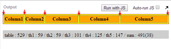
table寬度預設為100%,會隨視窗大小改變寬度。表格下方會顯示table寬度、5個th的寬度、5個th寬度加總,括號中則為th加總與table寬度的差距。在這個範例中,會有38px的差異,來自三個地方:
1) table border-spacing: 3px, 共6個(上圖紅箭頭所指), 3px * 6 = 18px
2) th border: 1px, 左右各1px,(1px + 1px) * 5 = 10px
3) th padding: 1px, 左右各1px,(1px + 1px) * 5 = 10px
18+10+10 = 38,這就是38px的由來。
試著改變視窗寬度,觀察不同table寬度下的欄寬變化:
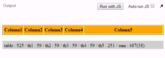
table : 819 / th1 : 83 / th2 : 83 / th3 : 163 / th4 : 205 / th5 : 247 / sum : 781(38)
table : 688 / th1 : 69 / th2 : 69 / th3 : 135 / th4 : 171 / th5 : 206 / sum : 650(38)
table : 579 / th1 : 59 / th2 : 59 / th3 : 112 / th4 : 141 / th5 : 170 / sum : 541(38)
table : 492 / th1 : 59 / th2 : 59 / th3 : 93 / th4 : 112 / th5 : 131 / sum : 454(38)
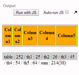
table : 342 / th1 : 59 / th2 : 59 / th3 : 60 / th4 : 62 / th5 : 64 / sum : 304(38)
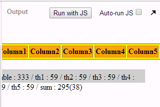
table : 333 / th1 : 59 / th2 : 59 / th3 : 59 / th4 : 59 / th5 : 59 / sum : 295(38)
由測試結果可以歸納出瀏覽器決定欄寬的原則: table寬度扣除border-sapcing, border, padding後,會視各欄寬設定值依比例分配寬度,但不能小於內容寬度(在本例中為59)。
當然,不能小於內容寬度的限制可透過CSS技巧解決,例如: th { word-break: break-all; }
搞懂欄寬分配原則後,剩下一個問題,怎麼讓最後一欄接收剩餘寬度卻又不會在寬度不足時消失?
試試<col style="min-width: 60px" />吧! 成功~ (灑花)
Comments
Be the first to post a comment