佔滿剩餘網頁寬/高度的美妙解法 - CSS Flexbox
 |  | 1 |  |
本篇為 CSS 小雜魚發自內心的驚喜,高手請自行迴避,切忌嘲諷唾棄。
Lag 好幾年才學會,我心中的網頁排版千古難題,原來早有輕鬆解法。「左側選單寬度固定,其餘空間顯示內容」、「選單或工具列置頂,最下方有狀態列,中間所有空間用來顯示內容」是常見的網頁配置需求,可惜我一直不得其法,這些年用過不少怪招 ( margin-left、table,甚至 window.onresize ),雖最後都能交差,但總覺得繞路且不牢靠。之前約略看過 CSS 新推的 flex 排版,貌似強大但有點小複雜,一直沒認真搞懂它(一方面也是擔心 IE 不相容,另一方面是沒找到立即可用的場合)。前陣子寫網頁又遇到佔滿剩餘空間需求,忽然覺得自己該有點長進,加上現在 IE 也全面拉到 IE11,有些新科技可大方拿出來用。研究了一下,flex 真的是這類排版需求最美妙的解法!
CSS Flexbox 已經推出一段時間,網路上教學很多,我就不耍大刀了,大家請自行爬文參考。這裡附上我的主要參考文件:
- 圖解 Flexbox 基本屬性 by 桑莫
- 圖解 Flexbox 進階屬性 by 桑莫
- 详解 flex-grow 与 flex-shrink by xieranmaya
如果你想弄懂縮放比例計算公式,大推這篇 - Flexbox Playground
完整的線上實驗室,可測試不同設定樣式的排版結果
至於 Flexbox 的瀏覽器支援問題,現在只需在意 IE11,依據 Can I Use,IE11 支援但有些 Bug,用在填滿剩餘空間排版這類簡單應用,我實測倒是沒有任何問題。
廢話說完,直接看範例,說明我寫在註解,應該不會太難懂。
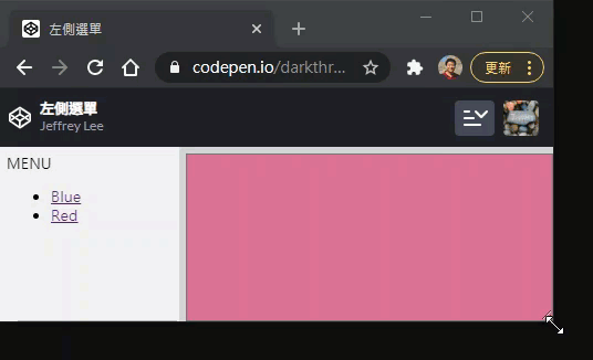
範例一、左欄固定寬度,右欄填滿
<html>

<head>
    <meta http-equiv="X-UA-Compatible" content="IE=Edge" />
    <meta http-equiv="Content-type" content="text/html; charset=utf-8" />
    <title>左欄固定寬度,右欄填滿</title>
    <style>
        html, body {
            height: 100%; margin: 0; font-size: 10pt;
            font-family: 微軟正黑體, Arial, Helvetica, sans-serif;
        }
        .content {
            display: flex; /* 採用 flex 排版 */
            height: 100%; padding: 0;
        }
        div { padding: 6px; }
        .side-menu {
            /* 設固定寬度,flex-grow 預設 0,flex-shrink 預設 1 */
            /* 設寬度可用 width 或 flex-basis,垂直排列時 flex-basis 代表 height */
            width: 150px; background-color: #eee;
        }
        .main-win {
            /* 因 side-menu flex-grow=0,main-win flex-grow=1 吃掉 100% 多餘寬度 */
            flex-grow: 1; background-color: lightgray;
        }
        textarea { width: 100%; height: 100%; }
    </style>
</head>

<body>
    <div class="content">
        <div class="side-menu">
            MENU
            <ul>
                <li>
                    <a href="#" onclick="display('powderblue')">Blue</a>
                </li>
                <li>
                    <a href="#" onclick="display('palevioletred')">Red</a>
                </li>
            </ul>
        </div>
        <div class="main-win">
            <textarea id="display"></textarea>
        </div>
    </div>
    <script>
        function display(color) {
            document.getElementById("display").style.backgroundColor = color;
        }
    </script>
</body>

</html>
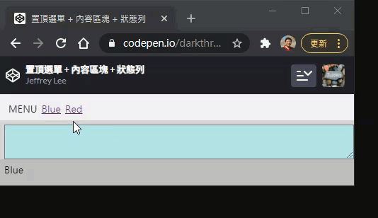
範例二、置頂選單 + 內容區塊 + 狀態列,內容填滿剩餘高度
<html>

<head>
    <meta http-equiv="X-UA-Compatible" content="IE=Edge" />
    <meta http-equiv="Content-type" content="text/html; charset=utf-8" />
    <title>置頂選單 + 內容區塊 + 狀態列</title>
    <style>
        html, body {
            height: 100%; margin: 0; font-size: 10pt;
            font-family: 微軟正黑體, Arial, Helvetica, sans-serif;
        }
        .content {
            /* flex 直式排列 */
            display: flex; flex-direction: column;
            height: 100%; padding: 0;
        }
        div { padding: 6px; }
        .top-menu {
            height: 25px;
            /* 或者寫 flex-basis: 28px 亦可,二者並存 flex-basis 優先 */
            background-color: #eee;
        }
        .main-win {
            flex-grow: 1; /* top-menu, status 未設 flex-grow,本列佔用所有剩餘空間 */
            background-color: lightgray;
        }
        .status {
            height: 25px; background-color: #bbb;
        }
        textarea { width: 100%; height: 100%; }
        .float > span { float: left; margin-right: 6px; }
    </style>
</head>

<body>
    <div class="content">
        <div class="top-menu">
            <div class="float">
                <span>MENU</span>
                <span>
                    <a href="#" onclick="display('powderblue', 'Blue')">Blue</a>
                </span>
                <span>
                    <a href="#" onclick="display('palevioletred', 'Red')">Red</a>
                </span>
            </div>
        </div>
        <div class="main-win">
            <textarea id="display"></textarea>
        </div>
        <div class="status" id="message">
        </div>
    </div>
    <script>
        function display(color, msg) {
            document.getElementById("display").style.backgroundColor = color;
            document.getElementById("message").innerText = msg;
        }
    </script>
</body>

</html>
範例三、依比例縮放
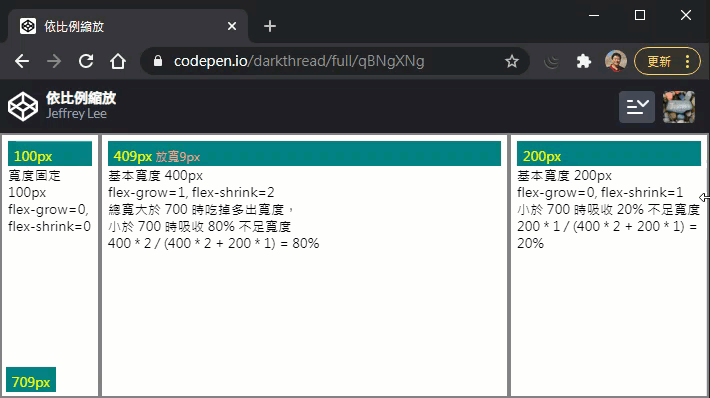
左欄寬度固定,中間欄吃掉所有多餘寬度,寬度不足時則縮小,右欄不放大,但寬度不足時會縮小。
我寫了一小段 JavaScript 顯示總寬及中、右欄的縮放值,印證公式。
中欄跟右欄的 flex-shrink 值為 2 vs 1,實際縮小比例需乘上基準寬度(flex-basis),故為 80% vs 20%。
完整公式解說可參考這篇
<html>

<head>
    <meta http-equiv="X-UA-Compatible" content="IE=Edge" />
    <meta http-equiv="Content-type" content="text/html; charset=utf-8" />
    <title>依比例縮放</title>
    <style>
        html, body {
            height: 100%; margin: 0; font-size: 10pt;
            font-family: 微軟正黑體, Arial, Helvetica, sans-serif;
        }
        .content {
            display: flex; height: 100%; padding: 0;
        }
        .content>div {
            border: 2px solid gray; padding: 6px;
            /* 設定 border-box,width 要內含 padding 與 border */
            box-sizing: border-box;
        }
        .col1 {
            /* flex-basis 優先於 width 或 height */
            flex-basis: 100px; flex-grow: 0; flex-shrink: 0;
        }
        .col2 {
            /* 以下寫法相當於 flex-grow: 1; flex-shrink: 2; flex-basis: 400px; */
            flex: 1 2 400px;
        }
        .col3 { flex: 0 1 200px; }
        div { padding: 6px; }
        .disp { background-color:teal; color: yellow; height: 1em; }
        #totalWidth { position: absolute; bottom: 6px; left: 6px; }
        .delta { font-size: 0.8em; color: lightsalmon;}
    </style>
</head>

<body>
    <div id="totalWidth" class="disp"></div>
    <div class="content">
        <div class="col1" data-width="100">
            <div class="disp"></div>
            寬度固定 100px <br/>
            flex-grow=0, flex-shrink=0
        </div>
        <div class="col2" data-width="400">
            <div class="disp"></div>
            基本寬度 400px <br />
            flex-grow=1, flex-shrink=2<br/>
            總寬大於 700 時吃掉多出寬度,<br />
            小於 700 時吸收 80% 不足寬度 <br />
            400 * 2 / (400 * 2 + 200 * 1) = 80%

        </div>
        <div class="col3" data-width="200">
            <div class="disp"></div>
            基本寬度 200px <br />
            flex-grow=0, flex-shrink=1<br/>
            小於 700 時吸收 20% 不足寬度 <br />
            200 * 1 / (400 * 2 + 200 * 1) = 20%
        </div>
    </div>
    <script>
        function resizeEvent() {
            for (var i = 1; i<=3; i++) {
                var container = document.querySelector(".col" + i);
                var defWidth = container.getAttribute("data-width") * 1;
                var currWidth = container.offsetWidth;
                var delta = currWidth - defWidth;
                var deltaText = "";
                if (delta !== 0) deltaText = (delta > 0 ? "放寬" : "縮小") + Math.abs(delta) + "px";
                container.querySelector(".disp").innerHTML =
                    currWidth + "px <span class='delta'>" + deltaText + "</span>";
            }
            document.getElementById("totalWidth").innerText =
                window.document.body.offsetWidth + "px";
        }
        window.onresize = resizeEvent;
        resizeEvent();
    </script>
</body>

</html>
This article shows how to use display: flex to implement fixed width/height + remaining space layout.
Comments
# by TLChen
讚喔