【笨問題】為什麼盒鬚圖的大小與上下位置相近,最大值卻差那麼多?
 |  | 2 |  |
這大概是沒有紮實數學基礎又不熟程式語言,全靠爬文跟 AI 硬寫時會經歷的過程吧。
我嘗試用 Python 將數據轉成箱形圖(又稱為盒鬚圖、盒式圖、盒狀圖或箱線圖,似乎較常被稱為「盒鬚圖」),以便觀察效能概況及異常偏慢的頻率。
惡補盒鬚圖畫法及解讀方式,其結構如下:
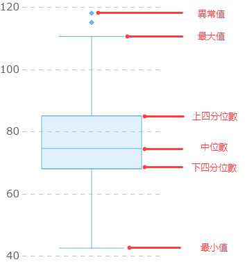
圖片及參考來源:掌握盒鬚圖:盒狀圖基本概念、解讀技巧和分析案例 by FineBI、中文維基百科
每個盒鬚圖案可呈現一組數值的最大值、最小值、中位數(Q2)、上四分位數(Q3)、四分位距(IDR = Q3 - Q1):
- 最大值 Maximum:是用於區分異常值的最大值,不是資料的最大值。最大值 = Q3 + 1.5 * IQR。
- 上四分位數 Q3 Upper Quartile:是樣本中所有數值由小到大排列後的第 75% 的數值。
- 中位數 Q2:是樣本中所有數值由小到大排列後的第50%的數值,即中間的數值。
- 下四分位數 Q1 / Lower Quartile:是樣本中所有數值由小到大排列後的第25%的數值。
- 最小值 Minimum:是用於區分異常值的最小值,不是資料的最小值。最小值 = Q1 - 1.5 * IQR。
- 四分位間距 IQR (InterQuartile Range):是 Q3 和 Q1 的差值,即 Q3 - Q1,一定程度上反映資料的集中程度,間距越小說明資料越集中。
- 異常值 / 離群值 (Outlier):是位於最大和最小值之外的資料點。另再區分:1.5 * IQR 到 3 * IQR 範圍為適度離群值(Mild Outlier)、超過 3 * IDR 範圍者為極端離群值(Extreme Outlier)。
惡補完基本知識,開啟 Github Copilot 導航,即使還沒出 Python 新手村,一陣亂揮瞎砍,圖照樣畫好。(但心理有些不踏實就是了)
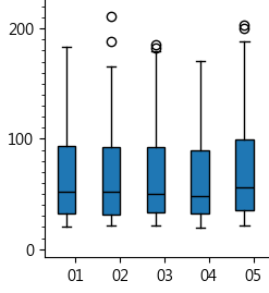
只是看到結果有點迷惑,01 到 05 這五組資料,盒高(IDR)差不多,盒子上緣(Q3)位置也相近,照理上鬚橫線的最大值 Q3 + 1.5 * IDR,應該要等高才對,為什麼 02 跟 04 特別短,而且 02 上方還有離群值,代表存在比最大值還大的異常值,為什麼 02 最大值會比 01 低一大截?
花了點時間,重查資料,最後在盒鬚圖的英文維基找到比較完整說明:
鬚必須落在觀察到的資料點上,但有多種定義方式。最簡單粗暴的做法是取資料集的最大值與最小值做為上下鬚邊界。由於定義有不同變化形,在描述箱形圖時需明確說明所用的鬚和離群值(Outliers)的定義。
另一種常見的鬚的邊界選擇方法是基於 1.5 倍的四分位距(IQR = Q3 - Q1)。從第三四分位數(Q3)開始,測量出 1.5 倍的 IQR 距離,並將鬚畫到落在此距離內的最大觀察數據點。同樣地,從第一四分位數(Q1)開始,測量出 1.5 倍 IQR 距離,並將鬚畫到落在此距離內的最小觀察數據點。由於鬚必須終止於觀察數據點,鬚的長度可能看起來不相等,即使 1.5 倍的 IQR 在兩邊都是相同的。所有超過鬚邊界的觀察數據點都被視為離群值,並在箱形圖上以點、小圓圈、星號等形式標示出來。
(原文)
The whiskers must end at an observed data point, but can be defined in various ways. In the most straightforward method, the boundary of the lower whisker is the minimum value of the data set, and the boundary of the upper whisker is the maximum value of the data set. Because of this variability, it is appropriate to describe the convention that is being used for the whiskers and outliers in the caption of the box-plot.
Another popular choice for the boundaries of the whiskers is based on the 1.5 IQR value. From above the upper quartile (Q3), a distance of 1.5 times the IQR is measured out and a whisker is drawn up to the largest observed data point from the dataset that falls within this distance. Similarly, a distance of 1.5 times the IQR is measured out below the lower quartile (Q1) and a whisker is drawn down to the lowest observed data point from the dataset that falls within this distance. Because the whiskers must end at an observed data point, the whisker lengths can look unequal, even though 1.5 IQR is the same for both sides. All other observed data points outside the boundary of the whiskers are plotted as outliers. The outliers can be plotted on the box-plot as a dot, a small circle, a star, etc.
先前查到的幾篇文章與中文維基沒強調「鬚必須落在觀察到的資料點」,故實際上下鬚端點將由最接近 1.5 * IDR 範圍的資料點位置決定,這樣就能解釋為什麼 Q3 與 IDR 相近,但上鬚端點位置卻差那麼多,這種情況在資料愈稀疏時愈明顯。
寫一小段範例完整實測驗證,順便累積 Python 飛行時數。未來如遇到奇怪案例,也可丟資料進來用它驗證。
import matplotlib.pyplot as plt
import numpy as np
import pandas as pd

# 準備兩組對照測試資料
d1 = [2,2,3,4,5,6,7,8,9] # 第 1 個數字放 2
d2 = [1,2,3,4,5,6,7,8,14] # 最後數字故意放 14 製造離群值

# 計算 Q1, Q2, Q3, IDR, 上下界, 上下鬚, 離群值
def calculate_stats(arr):
    Q1 = np.percentile(arr, 25)
    Q2 = np.percentile(arr, 50)
    Q3 = np.percentile(arr, 75)
    IQR = Q3 - Q1
    upper_bound = Q3 + 1.5 * IQR
    lower_bound = Q1 - 1.5 * IQR
    upper_whisker = max([x for x in arr if x <= upper_bound])
    lower_whisker = min([x for x in arr if x >= lower_bound])
    print(f"Q1: {Q1}, Q2: {Q2}, Q3: {Q3}, IQR: {IQR}")
    print(f"Lower Bound: {lower_bound}, Upper Bound: {upper_bound}")
    print(f"Lower Whisker: {lower_whisker}, Upper Whisker: {upper_whisker}")
    outliers = [x for x in arr if (x > upper_bound) or (x < lower_bound)]
    print(f"Outliers: {outliers}")

print("資料1", d1)
calculate_stats(d1)
print("\n資料2", d2)
calculate_stats(d2)

# 組成 Data Frame
data = pd.DataFrame({'TestA': d1, 'TestB': d2})

# 繪製盒鬚圖
plot_dict = plt.boxplot(data.values)
plt.xticks([1, 2], data.columns)

plt.xlabel('Tests')
plt.ylabel('Values')
plt.title('Boxplot of TestA and TestB')
plt.show()

# 查詢盒鬚圖繪製座標點,印證自行運算結果
for i, b in enumerate(plot_dict['boxes']):
    ys = b.get_ydata()
    xs = b.get_xdata()
    print(f"\nbox[{i}] 繪製座標點")
    for x, y in zip(xs, ys):
        print(f"(x:{x:.1f}, y:{y:.1f})", end=" ")
for i, w in enumerate(plot_dict['caps']):
    ys = w.get_ydata()
    xs = w.get_xdata()
    print(f"\ncaps[{i}] 繪製座標點")
    for x, y in zip(xs, ys):
        print(f"(x:{x:.1f}, y:{y:.1f})", end="  ")
我準備了兩組測試數據:
d1 = [2,2,3,4,5,6,7,8,9] # 第 1 個數字放 2
d2 = [1,2,3,4,5,6,7,8,14] # 最後數字故意放 14 製造離群值
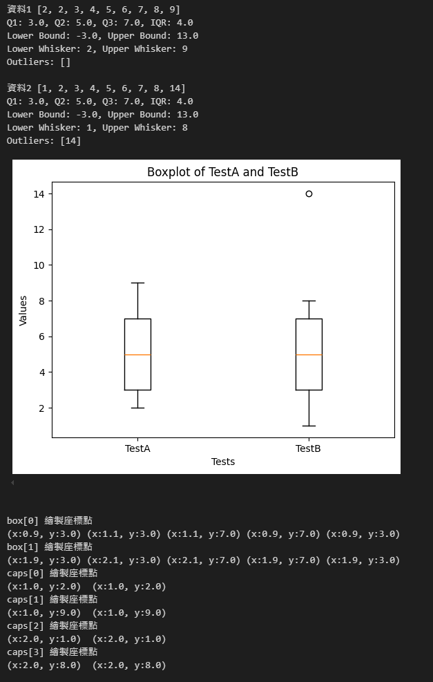
兩組 Q1、Q2、Q3 相同,IDR 也相同,上界為 13,下界為 -3。
d1 最小為 2,d2 為 1,故 d1 下鬚到 2,而 d2 到 1。
d1 最大為 9 小於 13,故上鬚到 9;d2 小於 13 的最大值為 8,故上鬚到 8;d2 最大值 14 > 13,成為離群值,即位於 14 的空心點。
boxplot() 回傳的 Dictionary 可取得盒子、鬚線、鬚線端橫線等座標值,由這些點的座標值亦可知 d1 上鬚在 9、d2 為 8,得證。
The blog discusses creating and interpreting boxplots using Python to visualize data performance and identify outliers. It explains the components of a boxplot and verifies the calculations with a Python example, demonstrating how whiskers end at observed data points within 1.5 IQR.
Comments
# by Ka-iu
文章內的四分位距似乎出現兩種解釋,其中一個應該是寫錯了: 四分位距(IDR = Q3 - Q2) → 四分位距(IDR = Q3 - Q1)
# by Jeffrey
to Ka-iu,對,寫錯了。謝謝指正。